Neops Web Client 5.0.0
Released 2026-09-08
This release improves how users explore network relationships, manage dashboards and tasks, compare configuration versions, and follow running executions. It also adds an optional link to the Workflow manager for deployments that provide one.
At a glance
| Area | What changed | Why it matters |
|---|---|---|
| Network diagrams | Detail and cluster layouts replace the legacy graph renderer and add configurable fields, labels, arrows, tooltips, dialogs, and dashboard links. | Users can read a small topology in depth or scan a larger one without losing access to operational details. |
| Dashboard display | A fit-to-screen action scales the dashboard to the available viewport and keeps popup content usable. | Dashboards designed for a larger workspace remain accessible on smaller screens and at higher browser zoom. |
| Dashboard expert mode | Field evaluation now reports results per item, explains empty data, and exposes the card configuration being edited. | Dashboard authors can see why an expression works for some items, fails for others, or returns nothing. |
| Task cockpit | Active tasks can be archived, archived tasks can be restored, and permanent deletion requires confirmation. | The everyday task list stays focused without losing the ability to recover or deliberately remove old tasks. |
| Configuration history | Selecting an earlier configuration reliably opens a side-by-side diff. | Users can identify the lines changed before applying, troubleshooting, or reviewing a configuration. |
| Executions | Progress is scoped to the current user, rows prioritize the task name, and the slide-in is chronological. | Users can follow their own work from the first execution to the newest without another username hiding the task name. |
| Workflow manager | Deployments can expose an optional header link to the Workflow manager. | Users can move from Neops to workflow monitoring without knowing or bookmarking a separate URL. |
Highlights
Explore richer network diagrams
Network diagram cards now offer detail and cluster layouts for different information densities. You can configure the content shown for nodes and links, display interface labels and directional arrows, and inspect additional information in tooltips and detail dialogs.
Nodes and links can also open related dashboards, making it easier to move from a network overview to the relevant operational detail.
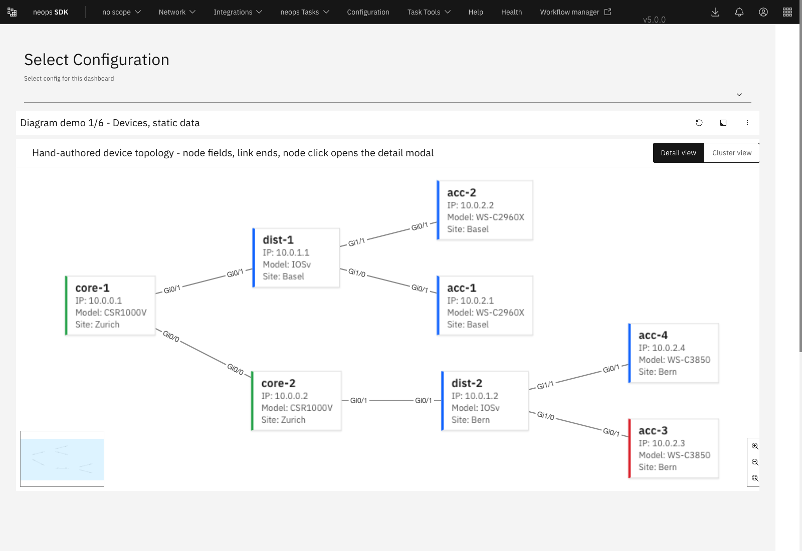
Detail view shows configured node fields and interface labels directly on the topology.
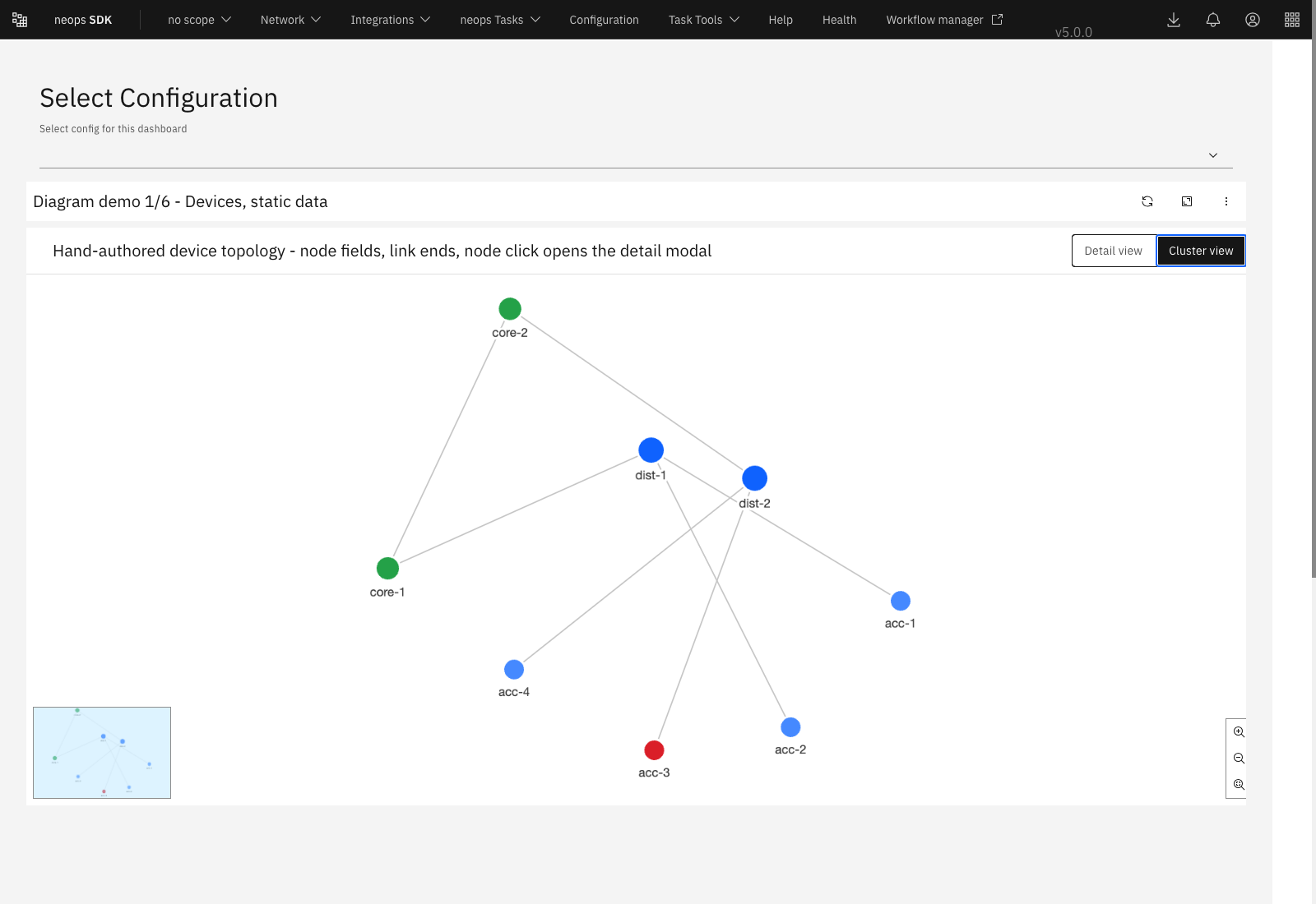
Cluster view presents the same topology more compactly for larger diagrams.
Choose the view based on the question you are answering:
| Mode | Best for | What remains visible |
|---|---|---|
| Detail | A smaller topology where device identity and interface context matter immediately. | Node fields, device-style cards, link labels, and the configured interaction details. |
| Cluster | A larger topology where shape, grouping, and highly connected nodes matter first. | Compact colored nodes, links, hover details, and access to the same dialogs. |
| Auto | Dashboards that can receive both small and large results. | Detail view below the configured threshold and Cluster view at or above it. |
A user can start with the topology shape, hover a node or link for a quick answer, open its detail dialog for the configured fields, and follow a configured dashboard link for deeper investigation.
Configuration you can use
The existing network-diagram-static, network-diagram-jmes, and network-diagram-topology cards keep their card IDs, but now accept a shared set of display and interaction settings.
{
  "cardId": "network-diagram-static",
  "data": {
    "densityMode": "detail",
    "maxNodes": 150,
    "showEndLabels": true,
    "showLinkArrows": false,
    "showNodeModal": true,
    "showLinkModal": true,
    "showNodeTooltip": "cluster",
    "showLinkTooltip": true,
    "nodes": [
      {
        "id": "core-1",
        "label": "core-1",
        "ip": "10.0.0.1",
        "model": "CSR1000V",
        "site": "Zurich"
      },
      {
        "id": "dist-1",
        "label": "dist-1",
        "ip": "10.0.1.1",
        "model": "IOSv",
        "site": "Basel"
      }
    ],
    "links": [
      {
        "id": "uplink-1",
        "source": "core-1",
        "target": "dist-1",
        "sourceInterface": "Gi0/1",
        "targetInterface": "Gi0/1",
        "status": "UP"
      }
    ],
    "nodeFields": [
      { "source": "attribute", "key": "ip", "label": "IP" },
      { "source": "attribute", "key": "model", "label": "Model" },
      { "source": "attribute", "key": "site", "label": "Site" }
    ],
    "linkFields": [
      { "source": "attribute", "key": "sourceInterface", "label": "From port" },
      { "source": "attribute", "key": "targetInterface", "label": "To port" },
      { "source": "attribute", "key": "sourceStatus", "label": "State" }
    ]
  }
}
densityMode accepts auto, detail, or cluster.
In auto mode, diagrams switch to Cluster view at autoThreshold, which defaults to 25 nodes.
maxNodes defaults to 150 and keeps the most connected nodes when a result is larger.
Node and link fields can read a direct data attribute as shown above, or evaluate a JMESPath expression by using "source": "jmes".
Optional nodeUrlExpression and linkUrlExpression settings can turn nodes and links into navigation targets.
Existing saved network diagram cards migrate automatically to the new configuration version. Their previous card IDs and data continue to work, while the new display and interaction defaults are applied without manual changes.
Keep dashboards usable and easier to diagnose
Fit a dashboard to the available screen
Dashboards were designed around a 1500 by 900 pixel workspace. On a smaller viewport or at higher browser zoom, the grid could extend beyond the visible area, forcing the user to zoom out manually and allowing card popups to be clipped.
The dashboard toolbar now includes Fit dashboard to screen beside refresh.
- Open the dashboard on the screen and at the browser zoom you want to use.
- Select Fit dashboard to screen.
- Neops measures the available dashboard area and scales the grid to fit it.
- Use Use normal dashboard size to return to the original scale.
| Before | With fit-to-screen enabled |
|---|---|
| The fixed-size grid can overflow the visible area. | The complete grid scales into the available area. |
| Users may need to change browser zoom manually. | The dashboard handles the scale while browser zoom remains unchanged. |
| Query suggestions and other portaled popups can be clipped by card boundaries. | Popup content is positioned against the scaled dashboard and remains accessible. |
The selected mode is saved in the browser under the current browser profile and is reused across dashboards. Normal size remains the default for a browser that has no saved preference.
Understand what an expert-mode field evaluated
Dashboard expert mode now distinguishes direct attribute names from JMESPath expressions according to each field’s configured source. It also reports evaluation per card item instead of presenting one result that may hide partial failures.
For example, if a field is evaluated across 20 diagram nodes and only 18 contain the requested data, expert mode reports the item count and shows labelled samples instead of implying that one sample represents every node.
| Situation | What expert mode now shows |
|---|---|
| The card contains several items | A match count and a labelled sample for each evaluated item. |
| The expression matches nothing | A clear empty-result explanation and the keys that are actually available. |
| The card receives no items | 0 of 0, without falling back to unrelated dashboard-level data. |
| The user is editing card configuration | The configuration being edited as its own inspectable data section. |
This is particularly useful when building node fields, link fields, dashboard navigation expressions, and other settings whose result depends on each item in the card.
Manage the complete task lifecycle
The task cockpit separates everyday work from retained history without treating archived tasks as deleted. The row menu changes with the current view:
| Current view | Available lifecycle actions | Result |
|---|---|---|
| Active tasks | Archive | The task leaves the active list and remains recoverable. |
| Archived tasks | Unarchive | The task returns to the active list. |
| Archived tasks | Delete permanently | Neops asks for confirmation before the task is removed permanently. |
Use the Show archived toggle in the table toolbar to switch between active and archived tasks. Each successful action displays a confirmation notification, and reopening the task cockpit starts in the active view.
Compare an earlier configuration with the current version
The Facts, Checks, and Config dialog now reliably opens a side-by-side diff when a previous configuration version is selected.
- Open the configuration view for the device or interface you are investigating.
- Select an earlier version from the comparison control.
- Review the older and current configuration together.
- Use the highlighted additions and removals to identify the exact change.
This also handles version identifiers returned by older backends as strings, so selecting a valid version no longer leaves the comparison view empty.
Follow executions more clearly
Dashboard cards that show task progress now ask only for active executions belonging to the authenticated user. A task started by another user no longer leaves a spinner on someone else’s card, and no user-specific spinner is shown before Neops knows who is signed in.
Execution rows now use two lines:
| First line | Second line | Fixed actions |
|---|---|---|
| Task name and execution ID | Execution type, username, timestamp, and run time | State icon and Show details |
The task name receives the flexible space on the first line, so a long username cannot reduce it to an unreadable fragment. When a task name or username still needs truncation, the full value is available through its overflow tooltip.
The execution slide-in orders entries from oldest to newest while preserving the current page and page size. Users can therefore read progress as a chronology, with earlier executions above the runs that followed them.
Open the Workflow manager from Neops
Deployments that configure a Workflow manager URL now show a link in the application header. The link includes the standard external-link indicator and opens the manager in a new browser tab, leaving the current Neops page open.
For a user, the flow is simply:
- Select Workflow manager in the Neops header.
- Use the manager to inspect workflow definitions and runs.
- Return to the original Neops tab without losing the current scope or dashboard.
Set the web client environment variable to the manager’s absolute URL:
Leave it empty to hide the link.
The value must be the absolute URL users should open, including https://.
Upgrade notes
| Reader | Required action |
|---|---|
| Standard Neops Web Client user | No migration is required. |
| Dashboard author | Existing saved network-diagram configurations continue to load with backward-compatible defaults. Add the new display and interaction fields only when needed. |
| Operator | Set FRONTEND_WORKFLOW_MANAGER_URL only if the deployment should expose the Workflow manager link. |
| Custom extension maintainer | Migrate code that directly uses the removed ngx-graph renderer API to the SDK 5 Cytoscape-based renderer. |
The compatibility neops-network-diagram selector and its primary control input remain available, but legacy renderer properties and rendered edge, SVG definition, and cluster templates are no longer part of the visual implementation.
Extensions that customize the diagram renderer should use neops-cytoscape-network-diagram and its nodeTemplate input.
Technical details