Network topology diagram card
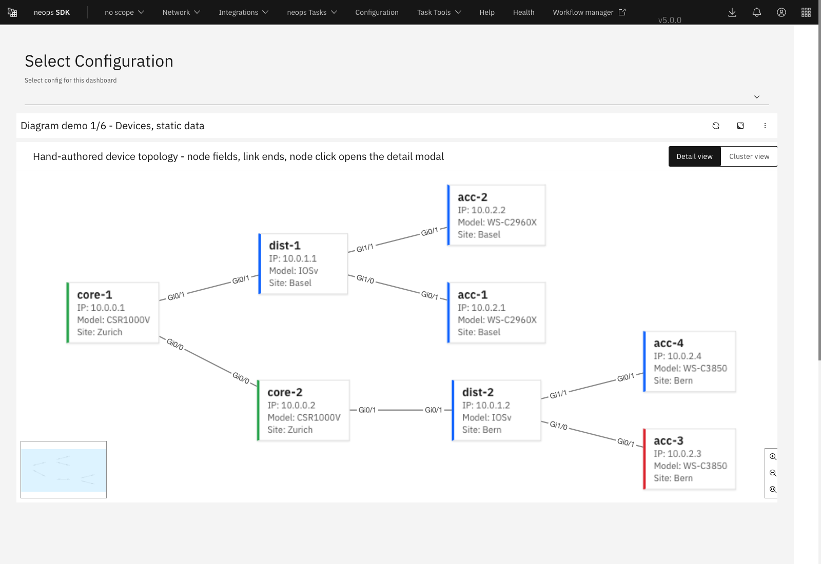
The Network topology diagram card renders devices and their links from the Neops Topology API and supports per-node dashboard navigation.
When to use it
Use it to explore a scoped network, inspect node or link details, and route from a selected node to a more specific dashboard.
Live example
The Card Lab supplies deterministic Topology API and device-attribute responses to the production card.
The fixture includes nodeUrlExpression, so clicking a node exercises the normal dashboard-navigation path.
Open the Network topology diagram Card Lab in a new page
The screenshot below remains as a release-reference comparison.
Requirements
| Requirement | Value |
|---|---|
| Dashboard types | Standard |
| Minimum size | 4 columns by 4 rows |
| Data | Topology nodes and links plus device attributes |
| Backend capabilities | Topology query and device element search |
| Permissions | Read access to topology and the displayed device fields |
Configuration
The paths below are relative to cardConfig.data.
title
| Property | Value |
|---|---|
| Type | string |
| Required | No |
| Default | No title |
| Values | Plain text |
Sets the card heading.
query
| Property | Value |
|---|---|
| Type | Neops search query string |
| Required | No |
| Default | Dashboard device query, then * |
| Values | A query that scopes the Topology API device set |
Overrides the dashboard device search for this topology.
A bounded query such as a group or site is normally required for links; a global * can return nodes without connected links.
limit
| Property | Value |
|---|---|
| Type | Integer |
| Required | No |
| Default | Resolved maxNodes, normally 150 |
| Values | Positive backend topology limit |
Limits devices requested from the Topology API.
densityMode
| Property | Value |
|---|---|
| Type | string |
| Required | No |
| Default | auto |
| Values | auto, detail, or cluster |
Selects labelled node cards, compact dots, or automatic selection by node count.
autoThreshold
| Property | Value |
|---|---|
| Type | Integer |
| Required | No |
| Default | 25 |
| Values | Integer at least 1 |
In auto mode, this node count and above uses cluster density.
showEndLabels
| Property | Value |
|---|---|
| Type | Boolean |
| Required | No |
| Default | true |
| Values | true or false |
Shows source and target interface labels at the ends of links.
showLinkArrows
| Property | Value |
|---|---|
| Type | Boolean |
| Required | No |
| Default | true |
| Values | true or false |
Shows link direction arrowheads.
showNodeModal
| Property | Value |
|---|---|
| Type | Boolean |
| Required | No |
| Default | true |
| Values | true or false |
Opens node details on click when nodeUrlExpression does not resolve to a URL.
showLinkModal
| Property | Value |
|---|---|
| Type | Boolean |
| Required | No |
| Default | true |
| Values | true or false |
Opens link details on click when linkUrlExpression does not resolve to a URL.
nodeUrlExpression
| Property | Value |
|---|---|
| Type | JMESPath expression |
| Required | No |
| Default | No navigation |
| Values | Per-node expression returning a dashboard URL string |
When the expression resolves for a clicked node, navigation takes precedence over the node modal. Navigation uses the shared dashboard helper, so local filters from the dashboard being left are not carried to the target URL.
linkUrlExpression
| Property | Value |
|---|---|
| Type | JMESPath expression |
| Required | No |
| Default | No navigation |
| Values | Per-link expression returning a dashboard URL string |
When it resolves for a clicked link, navigation takes precedence over the link modal.
maxNodes
| Property | Value |
|---|---|
| Type | Integer |
| Required | No |
| Default | 150 |
| Values | Integer at least 1 |
Caps rendered nodes for layout performance. When a graph is larger, the renderer keeps the highest-degree nodes.
showNodeTooltip
| Property | Value |
|---|---|
| Type | string |
| Required | No |
| Default | cluster |
| Values | cluster, always, or never |
Controls when hovering a node opens its tooltip.
showLinkTooltip
| Property | Value |
|---|---|
| Type | Boolean |
| Required | No |
| Default | true |
| Values | true or false |
Controls link hover tooltips.
nodeFields
| Property | Value |
|---|---|
| Type | Array of field objects |
| Required | No |
| Default | IP and Model attribute fields |
| Values | Ordered field definitions |
Controls fields displayed on detail-density nodes and in node details.
nodeFields[].source
| Property | Value |
|---|---|
| Type | string |
| Required | Yes |
| Default | No default |
| Values | attribute or jmes |
Chooses a direct node attribute lookup or a JMESPath expression against the merged node object.
nodeFields[].key
| Property | Value |
|---|---|
| Type | string |
| Required | Yes |
| Default | No default |
| Values | Attribute key or JMESPath expression, depending on source |
Selects the displayed value.
nodeFields[].label
| Property | Value |
|---|---|
| Type | string |
| Required | No |
| Default | The configured key |
| Values | Visible field label |
Labels the value.
linkFields
| Property | Value |
|---|---|
| Type | Array of field objects |
| Required | No |
| Default | The topology link’s built-in detail fields |
| Values | Ordered field definitions |
Overrides fields shown in link tooltips and modals.
linkFields[].source
| Property | Value |
|---|---|
| Type | string |
| Required | Yes |
| Default | No default |
| Values | attribute or jmes |
Chooses role-prefixed endpoint attributes or a JMESPath expression against the whole link.
linkFields[].key
| Property | Value |
|---|---|
| Type | string |
| Required | Yes |
| Default | No default |
| Values | Attribute key or JMESPath expression |
Selects the link value. Attribute keys are a configuration contract and are not derived from visible labels.
linkFields[].label
| Property | Value |
|---|---|
| Type | string |
| Required | No |
| Default | The configured key |
| Values | Visible field label |
Labels the link value.
nodeTooltipFields
| Property | Value |
|---|---|
| Type | Array of field objects |
| Required | No |
| Default | Falls back to nodeFields |
| Values | Ordered field definitions with the same shape as nodeFields |
Lets a hover tooltip show a different set of node values.
nodeTooltipFields[].source
| Property | Value |
|---|---|
| Type | string |
| Required | Yes |
| Default | No default |
| Values | attribute or jmes |
Chooses how the tooltip value is resolved.
nodeTooltipFields[].key
| Property | Value |
|---|---|
| Type | string |
| Required | Yes |
| Default | No default |
| Values | Attribute key or JMESPath expression |
Selects the tooltip value.
nodeTooltipFields[].label
| Property | Value |
|---|---|
| Type | string |
| Required | No |
| Default | The configured key |
| Values | Visible field label |
Labels the tooltip value.
Examples
Navigate from a device node
{
  "cardId": "network-diagram-topology",
  "data": {
    "title": "Site topology",
    "query": "groups.id: 42",
    "densityMode": "auto",
    "nodeFields": [
      { "source": "attribute", "key": "ip", "label": "IP" },
      { "source": "attribute", "key": "model", "label": "Model" }
    ],
    "nodeUrlExpression": "join('', ['/dashboards/device?deviceId=', to_string(id)])"
  }
}
Clicking a node whose expression returns a URL routes to the device dashboard instead of opening the detail modal.
Behavior
The card follows dashboard device-filter changes unless query overrides them, fetches topology plus device attributes, and lays out the result with Cytoscape.
Hover and click behavior follows the configured tooltip, modal, and URL precedence rules.
The renderer reacts to card resizing and scales portaled overlays with the dashboard.
Limitations and safety
Large graphs are intentionally capped and may omit low-degree nodes. JMESPath-generated URLs should point only to trusted in-application routes. Read access to a field remains controlled by the backend even when that field is named in configuration.